As we enter into the new year, our website has gotten some new updates! Check out the article below for details on the fresh additions to North Shore Bank’s site:
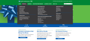
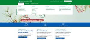
Streamlined Navigation
What’s New? Simplified main navigation menu offers users a more focused pathway to our product and service landing pages.
Why? Times and trends evolve, and we’ve observed a decline in the preference for mega navigation menus – particularly on mobile devices. Our research indicates that users benefit from a more straightforward menu, which gives us greater control over their journey on our website.
Additional Changes:
- Renamed “Customer Support” to “Contact Us” for clarity.
- Moved “About Us” from main navigation to top navigation area.
- Renamed “ATM, Branch & Video Teller Locations” to “Locations.”
- Streamlined footer links and content for a more cohesive user experience.
Enhanced Website Search
What’s New? We’ve enhanced the on-site search function to provide greater speed and accuracy, while the new admin customization capabilities contribute to a more efficient and personalized user experience.
Why? With a reduced number of links in the navigation menu, investing in an enhanced website search ensures users can easily find what they’re looking for.
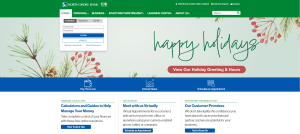
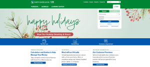
Relocation of the Login Area
What’s New? We’ve moved the login area to the right side of the navigation menu and reorganized the login options into two sections – Personal and Business.
Why? Following website design trends, login areas are now commonly found on the right side. Applying a similar structure to the main navigation (Personal and Business), and dropdown box functionality, makes the Login area a more intuitive experience for users.
03244


